Switching to documentation-as-code with Gatsby.js and Netlify — Layout & images (2/3)


This is the second part of our tutorial about managing documentation as code. I originally thought that 2 parts would be enough but this post is rather long and I’ll be adding another one for analytics and search.
Previously on this tutorial
I missed part 1, what’s this about?
At Squadlytics we decided recently to manage our documentation as code and use a static site generator (Gatsby) to publish them online. This decision was a lot motivated by a desire to get the benefits of versioning, reviews and deployment pipelines — but we also wanted to manage our costs better as we’re bootstrapping.
You can read more about our decision in the first part of the tutorial. Don’t hesitate to reach out on Twitter as well if you have any questions.
What we’ll see in part 2
In part 1 we learned how to use Gatsby to create a static website and use Markdown files for our docs. In part 2 we will create a better layout for our docs and add some images. It will still be pretty plain and not that pretty but you’ll be able to use it as a basis for your own needs.
Take me straight to the starter kit
If want to skip the tutorial you can clone the repo at https://github.com/squadlytics/docs-as-code-starterkit and follow the instructions to get started with your own docs.
Requirements
What you need
Before we get started you’ll need a few things:
- A terminal
- Node (this tutorial has been tested with v8.9.4)
- NPM 5+
- Git
- A Bitbucket or a Github repo that we’ll use to deploy to Netlify.
Getting ready for part 2
If you completed the part 1 of the tutorial you should already be good to go. But just in case I recommend cloning https://github.com/squadlytics/docs-as-code-part2 so that we can all have the same starting point.
Open your terminal and run the following commands.
git clone [email protected]:squadlytics/docs-as-code-part2.git
cd docs-as-code-part2
npm install
gatsby develop
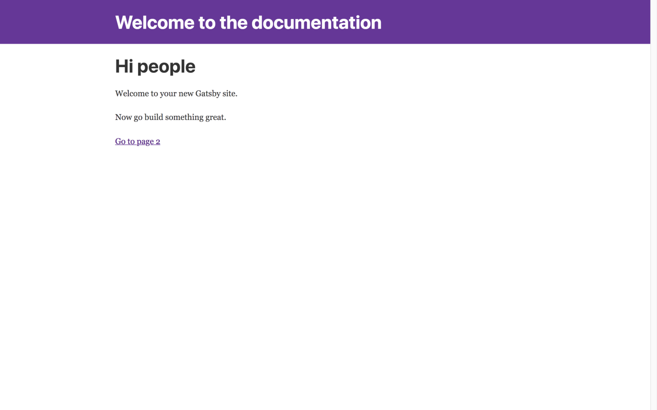
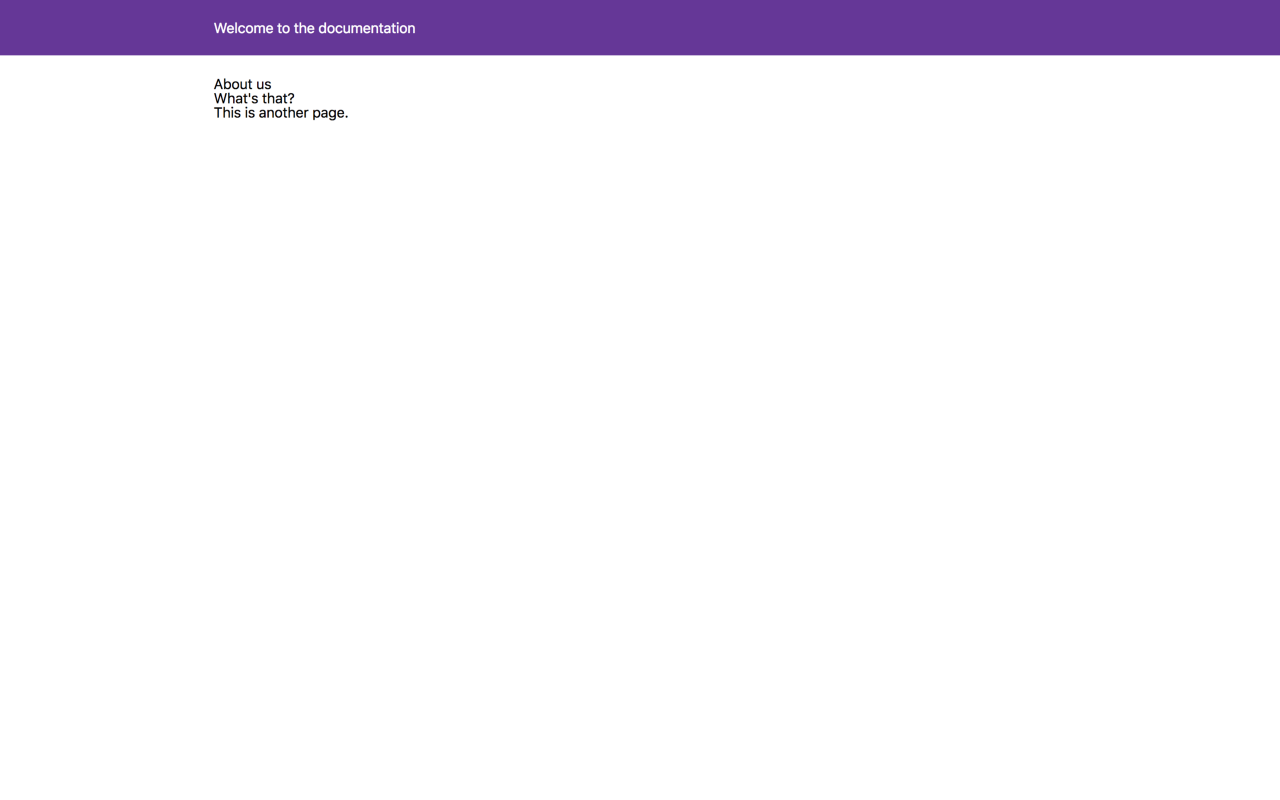
You should be able to go to http://localhost:8000/ and see the page below.
You should also be able to visit http://localhost:8000/getting-started and http://localhost:8000/about which are 2 doc pages generated from .md files.
This is our starting point and now we can start improving our documentation portal.
Getting our docs to look the part
There are a few issues with the current status of the docs:
- Our homepage is irrelevant and has links to a page we do not need (http://localhost:8000/page-2/)
- There’s no navigation to access the docs.
We’re going to fully reset the CSS of the website and then build the necessary parts one by one.
1. Installing styled components
It’s hard to describe the advantages of styled-components in a few words. It’s one of these things that you get to appreciate as you start using it. The top benefits for me are:
- Keeping styles outside of the React render function
- Being able to use nested styles à la Sass
- Being able to create a UI kit with a library of shared components (titles, button, dropdows, etc…).
I’ll be honest and it took me some time to get my head around the new syntax but now I love it. Shout out to Joshua Tjhin for showing me better ways to manage a UI library.
Prior to using styled-components we’re going to reset the CSS using Eric Meyer’s template (+ a couple custom styles for the body). Open up the CSS file at src/layouts/index.css and replace the content with the styles below.
/* src/layouts/index.css */
/* http://meyerweb.com/eric/tools/css/reset/
   v2.0 | 20110126
   License: none (public domain)
*/

html, body, div, span, applet, object, iframe,
h1, h2, h3, h4, h5, h6, p, blockquote, pre,
a, abbr, acronym, address, big, cite, code,
del, dfn, em, img, ins, kbd, q, s, samp,
small, strike, strong, sub, sup, tt, var,
b, u, i, center,
dl, dt, dd, ol, ul, li,
fieldset, form, label, legend,
table, caption, tbody, tfoot, thead, tr, th, td,
article, aside, canvas, details, embed,
figure, figcaption, footer, header, hgroup,
menu, nav, output, ruby, section, summary,
time, mark, audio, video {
	margin: 0;
	padding: 0;
	border: 0;
	font-size: 100%;
	font: inherit;
	vertical-align: baseline;
}
/* HTML5 display-role reset for older browsers */
article, aside, details, figcaption, figure,
footer, header, hgroup, menu, nav, section {
	display: block;
}
body {
	line-height: 1;
}
ol, ul {
	list-style: none;
}
blockquote, q {
	quotes: none;
}
blockquote:before, blockquote:after,
q:before, q:after {
	content: '';
	content: none;
}
table {
	border-collapse: collapse;
	border-spacing: 0;
}

/* After resetting we can start to add our own styles */

html, body{

}

body {
	background-color: #FFF;
	display: flex;
	flex-direction: column;
}
After saving the website should look like this.
The background color in the header is still present because it’s defined in the component itself. You can look at the code in src/components/Header/index.js to see how the purple background is set.
// src/components/Header/index.js
import React from 'react'
import Link from 'gatsby-link'
const Header = () => (
  <div
    style={{
      background: 'rebeccapurple',
      marginBottom: '1.45rem',
    }}
  >
    <div
      style={{
        margin: '0 auto',
        maxWidth: 960,
        padding: '1.45rem 1.0875rem',
      }}
    >
      <h1 style={{ margin: 0 }}>
        <Link
          to="/"
          style={{
            color: 'white',
            textDecoration: 'none',
          }}
        >
          Welcome to the documentation
        </Link>
      </h1>
    </div>
  </div>
)
export default Header
In the next sections of this tutorial we’re going to get rid of the inline styles and replaced it by styled-components. Let’s start by installing the package.
npm install --save styled-components
Then we’re going to create a new component that will define the general layout of the website. I called it Chrome, which is debatable, but for the sake of this tutorial let’s keep going — you can change the name later 🙂.
mkdir src/components/Chrome
touch src/components/Chrome/index.js
Now copy the code below in src/components/Chrome/index.js.
// src/components/Chrome/index.js
import React from 'react'
import PropTypes from 'prop-types'
import styled from 'styled-components'
const Container = styled.div`
  font-family: -apple-system, BlinkMacSystemFont, "Segoe UI", Roboto, Helvetica, Arial, sans-serif, "Apple Color Emoji", "Segoe UI Emoji", "Segoe UI Symbol";
`
const Chrome = ({ children }) => (
  <Container>
    {children}
  </Container>
)
Chrome.propTypes = {
  children: PropTypes.node,
}
export default Chrome
This component doesn’t do much for now apart from defining the font-family. I’ve highlighted in bold the new styled component that we have created.
We can now use our Chrome component in the layout of the website. Edit the file at src/layouts/index.js to use the newly created component.
// src/layouts/index.js
import React from 'react'
import PropTypes from 'prop-types'
import Helmet from 'react-helmet'
import Chrome from '../components/Chrome'
import Header from '../components/Header'
import './index.css'
const TemplateWrapper = ({ children }) => (
  <Chrome>
    <Helmet
      title="Welcome to the docs!"
      meta={[
        { name: 'description', content: 'Sample' },
        { name: 'keywords', content: 'sample, something' },
      ]}
    />
    <Header />
    <div
      style={{
        margin: '0 auto',
        maxWidth: 960,
        padding: '0px 1.0875rem 1.45rem',
        paddingTop: 0,
      }}
    >
      {children()}
    </div>
  </Chrome>
)
TemplateWrapper.propTypes = {
  children: PropTypes.func,
}
export default TemplateWrapper
If you look at the site in the browser it should now be using system fonts.
From now on, if you want to extend or change the css you can do so by editing the code of the Chrome component and add the CSS to the styled.div section.
We’ll leave it at that for now and will come back to it later.
2. Building the layout with 💪
When I started coding I remember fighting with 2 things quite often:
- Handling divs that were supposed to be side-by-side (hello float:left, hi clearfix).
- Aligning content vertically.
The struggle was real then but now this kind of thing is a breeze with the Flexbox Layout. Chris Coyier has written one the best guide for it and you should definitely keep it in your bookmarks. We’ll make use of display:flex a lot in the rest of the tutorial to position the elements so it may be a good idea to look at the guide now if you’re not familiar with it.
Let’s start by creating a new component for our sidebar.
mkdir src/components/Sidebar
touch src/components/Sidebar/index.js
Now copy the code below to create your Sidebar component.
// src/components/Sidebar/index.js
import React from 'react'
import Link from 'gatsby-link'
import styled from 'styled-components'
const SidebarContainer = styled.div`
  width:  250px;
  header {
    font-weight: bold;
    text-transform: uppercase;
    margin: 0 0 8px 0;
  }
  ul {
    margin: 0 0 16px 0;
  }
`
const Sidebar = () => (
  <SidebarContainer>
    <header>Quick start</header>
    <ul>
      <li><Link to="/getting-started">Getting Started</Link></li>
    </ul>
    <header>About</header>
    <ul>
      <li><Link to="/about">About us</Link></li>
    </ul>
  </SidebarContainer>
)
export default Sidebar
The code should now look familiar. We’ve used styled-components to define the look & feel of the sidebar and as you can see it’s easy to do CSS nesting. We’ve also linked the 2 pages that already exist using the Link component provided by Gatsby.
We can now add our sidebar to the layout. First we are going to pass the Header as a property to the Chrome component so that we can manage the entire UI layout there.
Open the file at /src/layouts/index.js and edit the code.
// src/layouts/index.js
import React from 'react'
import PropTypes from 'prop-types'
import Helmet from 'react-helmet'
import Chrome from '../components/Chrome'
import Header from '../components/Header'
import './index.css'
const TemplateWrapper = ({ children }) => (
  <Chrome header={<Header />}>
    <Helmet
      title="Welcome to the docs!"
      meta={[
        { name: 'description', content: 'Sample' },
        { name: 'keywords', content: 'sample, something' },
      ]}
    />
    <div>
      {children()}
    </div>
  </Chrome>
)
TemplateWrapper.propTypes = {
  children: PropTypes.func,
}
export default TemplateWrapper
I’ve highlighted the changes in bold — we are now passing the <Header /> component as a props to the Chrome component and we also removed the inline styles.
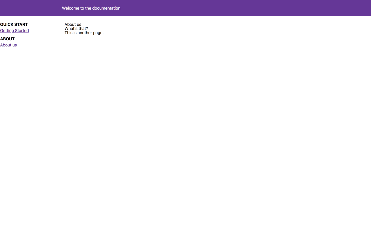
You can now go back to your Chrome component and edit the code to include the sidebar and the header.
// src/components/Chrome/index.js
import React from 'react'
import PropTypes from 'prop-types'
import styled from 'styled-components'
import Sidebar from '../Sidebar'
const Container = styled.div`
  font-family: -apple-system, BlinkMacSystemFont, "Segoe UI", Roboto, Helvetica, Arial, sans-serif, "Apple Color Emoji", "Segoe UI Emoji", "Segoe UI Symbol";
  display: flex;
  flex-direction: column;
  height: 100vh;
  overflow: auto;
`
const Content = styled.div`
  display: flex;
`
const Main = styled.div`
`
const Chrome = ({ children, header }) => (
  <Container>
    {header}
    <Content>
      <Sidebar />
      <Main>
        {children}
      </Main>
    </Content>
  </Container>
)
Chrome.propTypes = {
  children: PropTypes.node,
  header: PropTypes.node,
}
export default Chrome
Your documentation portal should now look like the picture below.
3. Polishing the design
Now that we have the basic layout done we can do quick edits on the different components to improve the look & feel a bit. As said before I am not a designer so this is going to be pretty plain but you can use it as a basis and change it as you see fit.
src/components/Chrome/index.js
// src/components/Chrome/index.js
import React from 'react'
import PropTypes from 'prop-types'
import styled from 'styled-components'
import Sidebar from '../Sidebar'
const Container = styled.div`
  font-family: -apple-system, BlinkMacSystemFont, "Segoe UI", Roboto, Helvetica, Arial, sans-serif, "Apple Color Emoji", "Segoe UI Emoji", "Segoe UI Symbol";
  display: flex;
  flex-direction: column;
  height: 100vh;
  overflow: auto;
  padding: 16px;
  color: #333;
  line-height: 1.2;
a {
    text-decoration: none;
    color: blue;
    &:hover {
      filter: brightness(80%);
    }
  }
`
const Content = styled.div`
  display: flex;
`
const Main = styled.div`
  display: flex;
  flex: 1 0 auto;
  h1 {
    font-size: 30px;
    font-weight: bold;
    margin-bottom: 26px;
  }
h2 {
    font-size: 26px;
    font-weight: bold;
    margin-bottom: 22px;
  }
h3 {
    font-size: 22px;
    font-weight: bold;
    margin-bottom: 18px;
  }
p {
    margin-bottom: 8px;
  }
`
const Page = styled.div`
  flex: 1;
`
const Chrome = ({ children, header }) => (
  <Container>
    {header}
    <Content>
      <Sidebar />
      <Main>
        <Page>
        {children}
        </Page>
      </Main>
    </Content>
  </Container>
)
Chrome.propTypes = {
  children: PropTypes.node,
  header: PropTypes.node,
}
export default Chrome
src/components/Header/index.js
// src/components/Header/index.js
import React from 'react'
import Link from 'gatsby-link'
import styled from 'styled-components'
const HeaderContainer = styled.div`
  margin-bottom: 16px;
  h1 {
    font-size: 22px;
    a {
      color: #333;
      text-decoration: none;
    }
  }
`
const Header = () => (
  <HeaderContainer>
    <h1>
      <Link
        to="/"
      >
        Acme docs
      </Link>
    </h1>
  </HeaderContainer>
)
export default Header
src/pages/index.js
// src/pages/index.js
import React from 'react'
import Link from 'gatsby-link'
import styled from 'styled-components'
const CardContainer = styled.div`
  display: flex;
  margin: 32px 0;
  justify-content: space-around;
`
const Card = styled(Link)`
  display: inline-block;
  border-radius: 4px;
  padding: 20px 40px;
  width: 250px;
  background-color: #aaa;
  color: #fff !important;
  text-align: center;
`
const IndexPage = () => (
  <div>
    <h1>Acme documentation</h1>
    <p>Welcome to your new documentation site!</p>
    <CardContainer>
      <Card to="/getting-started">
        Getting started
      </Card>
      <Card to="/about">
        About us
      </Card>
    </CardContainer>
  </div>
)
export default IndexPage
You can also remove src/pages/page-2.js as you won’t need it.
rm src/pages/page-2.js
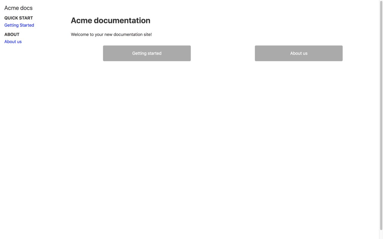
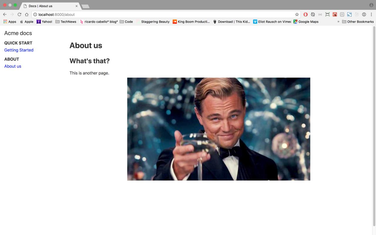
Your website should now look like the picture below.

Not the prettiest but you should know how to change that now!
4. Adding images to the docs
If you want to add images to your docs it’s pretty simple. Create a new folder to store your images in the src/docs directory.
mkdir src/docs/images
Add the image you want to display to that folder. In my case I’m using a still from the movie Gatsby that I saved as src/docs/images/gatsby.jpg.
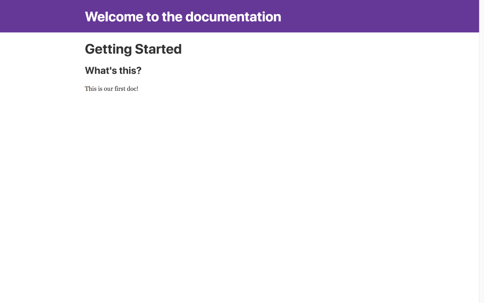
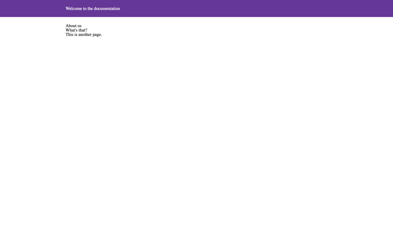
You can now simply reference that image in your Markdown. Open the doc at /src/docs/about.md to add the image.
---
path: "/about"
title: "About us"
---
## What's that?
This is another page.

This is possible thanks to the plugins gatsby-remark-copy-linked-files and gatsby-remark-images that were installed in the part 1 of the tutorial.
Deploying our new site.
You’ll find instructions to deploy a Git site online with Netlify in part 1 but you can also use our starter kit at https://github.com/squadlytics/docs-as-code-starterkit and follow the instructions to get your own docs.
What’s next?
In the next post we’ll look at adding analytics with Mixpanel and search via Algolia. I thought I would do it here but this part ended up being a bit longer than I expected.
Hopefully this is going to be helpful to some of you. Don’t hesitate to ask questions in the comments!
Squadlytics keeps the pulse of your team by providing insights on your productivity tools. Act on issues early and see the impact.