Switching to documentation-as-code with Gatsby.js and Netlify — Search & analytics (3/3)

This is the final part of our tutorial about managing documentation as code.
- Part 1: Managing content with Markdown files and hosting on Netlify.
- Part 2: Implementing a doc style layout.
Here we’ll see how we can add analytics with Mixpanel and search with Algolia DocSearch to our docs.
If you just want to get your own documentation site up & running you can find a starter kit on Github.
What you need
Before we get going you’ll need a few things:
- A terminal
- Node (this tutorial has been tested with v8.9.4)
- NPM 5+
- Git
- A clone of https://github.com/sten-squad/docs-as-code-part-3
Adding analytics with Mixpanel
I really like Mixpanel because it makes it super easy to define which actions you want to capture. With that being said the setup can be a bit tricky for a React SPA and sorting out the build was more complex than expected.
1. Keeping our config variables out of the code
As much as possible you should keep your config variables out of the code. Thankfully Gatsby provides an easy way to do that without having to install another package. We simply need to create a .env.development file at the root of the repository and add the required values there.
touch .env.development
Edit the file and add the following line (replace the key value with your own Mixpanel key). We’re going to prefix our environment variable with GATSBY_ so that we can use them directly in our build configuration later when we will deploy the code to Netlify.
#.env.development
GATSBY_MIXPANEL_KEY=<your mixpanel key>
Make sure that you restart your Gatsby environment to load the new variable.
2. mixpanel-browser to the rescue
We will use Mixpanel’s own package to configure the library and send events.
npm install --save mixpanel-browser
That’s it! Now we simply need to edit src/pages/index.js and src/templates/doc-templates.js to add the mixpanel call in componentDidMount.
src/pages/index.js
// src/pages/index.js
import React, { Component } from 'react'
import mixpanel from 'mixpanel-browser' // import the mixpanel lib
import Link from 'gatsby-link'
import styled from 'styled-components'


const CardContainer = styled.div`
  display: flex;
  margin: 32px 0;
  justify-content: space-around;
`

const Card = styled(Link)`
  display: inline-block;
  border-radius: 4px;
  padding: 20px 40px;
  width: 250px;
  background-color: #aaa;
  color: #fff !important;
  text-align: center;
`

class IndexPage extends Component {

  // Init and send the Mixpanel event
  componentDidMount() {
    if (process.env.GATSBY_MIXPANEL_KEY) {
      mixpanel.init(process.env.GATSBY_MIXPANEL_KEY)
      mixpanel.track("docs.view:homepage")
    }
  }

  render() {
    return (
      <div>
        <h1>Acme documentation</h1>
        <p>Welcome to your new documentation site!</p>
        <CardContainer>
          <Card to="/getting-started">
            Getting started
          </Card>
          <Card to="/about">
            About us
          </Card>
        </CardContainer>
      </div>
    )
  }
}

export default IndexPage
src/templates/docs-templates.js
// src/templates/docs-templates.js
import React, { Component } from 'react'
import mixpanel from 'mixpanel-browser' // import the mixpanel lib
import Helmet from 'react-helmet'

class Template extends Component {
  // Init and send the event
  componentDidMount() {
    const { markdownRemark: page } = this.props.data;
    if (process.env.GATSBY_MIXPANEL_KEY) {
      mixpanel.init(process.env.GATSBY_MIXPANEL_KEY)
      mixpanel.track(`docs.view:${page.frontmatter.title}`)
    }
  }

  render() {
    const { markdownRemark: page } = this.props.data;
    return (
      <div>
        <Helmet title={`Docs | ${page.frontmatter.title}`} />
        <div className="page">
          <header>
            <h1>{page.frontmatter.title}</h1>
            <span>{page.frontmatter.baseline}</span>
          </header>
          <div dangerouslySetInnerHTML={{ __html: page.html }} />
        </div>
      </div>
    );
  }
}
export default Template
export const pageQuery = graphql`
  query DocsByPath($path: String!) {
    markdownRemark(frontmatter: { path: { eq: $path } }) {
      html
      frontmatter {
        path
        title
      }
    }
  }
`
;
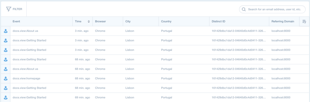
If you go to your live view in Mixpanel you should start seeing events when you browse the docs.
3. Deploying to Netlify
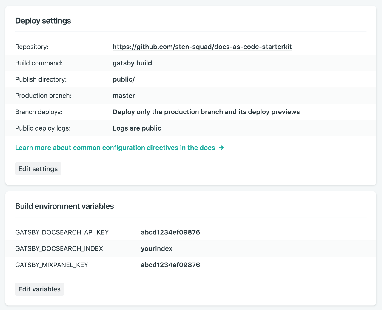
To deploy you simply need to follow the same steps as described a the end of part 1 and just add the required environment variable to your build environment.
Make sure that your variables are prefixed with GATSBY_
Adding search with Algolia DocSearch
Once you start having a few doc pages it will become critical to provide an easy way to navigate to the right content. This is where Algolia comes handy by providing a neat and easy way to add a search functionality.
1. Signing up for DocSearch
DocSearch is a free indexing service provided by Algolia that will crawl your website and produce an index for you. Once your docs are available online you simply need to sign up at https://community.algolia.com/docsearch/ to get your API Key and index reference.
2. Configuring DocSearch
Once you have your key and index name we can start setting up search in our app. We will need to add the DocSearch stylesheet at the end of the <head> section of our pages and the JS before the closing </body> tag. To do so we will copy the default HTML template provided by Gatsby and edit it to modify the core HTML of our app.
cp .cache/default-html.js src/html.js
Then edit the file to add the stylesheet and JS.
// src/html.js
import React from "react"

let stylesStr
if (process.env.NODE_ENV === `production`) {
  try {
    stylesStr = require(`!raw-loader!../public/styles.css`)
  } catch (e) {
    console.log(e)
  }
}

module.exports = class HTML extends React.Component {
  render() {
    let css
    if (process.env.NODE_ENV === `production`) {
      css = (
        <style
          id="gatsby-inlined-css"
          dangerouslySetInnerHTML={{ __html: stylesStr }}
        />
      )
    }
    return (
      <html {...this.props.htmlAttributes}>
        <head>
          <meta charSet="utf-8" />
          <meta httpEquiv="x-ua-compatible" content="ie=edge" />
          <meta
            name="viewport"
            content="width=device-width, initial-scale=1, shrink-to-fit=no"
          />
          {this.props.headComponents}
          {css}
          {/* DocSearch Stylesheet goes here */}
          <link rel="stylesheet" href="https://cdn.jsdelivr.net/npm/docsearch.js@2/dist/cdn/docsearch.min.css" />
        </head>
        <body {...this.props.bodyAttributes}>
          {this.props.preBodyComponents}
          <div
            key={`body`}
            id="___gatsby"
            dangerouslySetInnerHTML={{ __html: this.props.body }}
          />
          {this.props.postBodyComponents}
          {/* DocSearch JS goes here */}
          <script type="text/javascript" src="https://cdn.jsdelivr.net/npm/docsearch.js@2/dist/cdn/docsearch.min.js" />
        </body>
      </html>
    )
  }
}
You can use the same method in the future to add other services but in some cases (Mixpanel for instance) the build might fail due to some issues with Webpack and/or React.
Make sure that you also add 2 new environment variables for your API Key and index.
#.env.development
GATSBY_MIXPANEL_KEY=<your Mixpanel key>
GATSBY_DOCSEARCH_API_KEY=<your DocSearch API Key>
GATSBY_DOCSEARCH_INDEX=<your DocSearch index>
3. Adding a Searchbox to the UI
Let’s now create a new component for our search box.
touch components/Sidebar/SearchBox.js
Copy the code below to create a new search field. It uses the environment variables defined previously to configure the search service.
//src/components/Sidebar/SearchBox.js
import React from 'react'
import styled from 'styled-components'
import { navigateTo } from "gatsby-link"

const Container = styled.div`
  display: flex;
  flex: 1;
  input {
    display: inline-block;
    font-size: 14px;
    border: 1px solid #ccc;
    background-color: #fff;
    border-radius: 2px;
    height: 32px;
    line-height: 20px;
    vertical-align: baseline;
    box-sizing: border-box;
    width: 100%;
    padding: 8px 4px;
    margin-bottom: 10px;
  }
`

class SearchBox extends React.Component {
  constructor() {
    super()
    this.autocompleteSelected = this.autocompleteSelected.bind(this)
  }

  autocompleteSelected(e) {
    e.stopPropagation()
    // Use an anchor tag to parse the absolute url (from autocomplete.js) into a relative url
    // eslint-disable-next-line no-undef
    const a = document.createElement(`a`)
    a.href = e._args[0].url
    navigateTo(`${a.pathname}${a.hash}`)
  }

  componentDidMount(){
    window.addEventListener(
      `autocomplete:selected`,
      this.autocompleteSelected,
      true
    )

    if(window.docsearch){
      window.docsearch({
        apiKey: process.env.GATSBY_DOCSEARCH_API_KEY,
        indexName: process.env.GATSBY_DOCSEARCH_INDEX,
        inputSelector: '#docs-search',
        algoliaOptions: {
          hitsPerPage: 5
        },
        debug: true // Set debug to true if you want to inspect the dropdown,
      });
    }
  }

  render() {
    return (
      <Container>
        <form onSubmit={e => e.preventDefault()}>
          <input id="docs-search" type="search" placeholder="Search..." onFocus={() => this.setState({ focussed: true })}
          />
        </form>
      </Container>
    )
  }
}

export default SearchBox
Now you simply need to edit src/components/Sidebar/index.js and add that search field to the sidebar and we’re done!
// src/components/Sidebar/index.js
import React from 'react'
import Link from 'gatsby-link'
import styled from 'styled-components'
import SearchBox from './SearchBox'  // Import the SearchBox

const SidebarContainer = styled.div`
  width:  250px;
  header {
    font-weight: bold;
    text-transform: uppercase;
    margin: 0 0 8px 0;
  }
  ul {
    margin: 0 0 16px 0;
  }
`

const Sidebar = () => (
  <SidebarContainer>
    {/* Only display the searchbox if the env variables are properly configured */}
    {process.env.GATSBY_DOCSEARCH_API_KEY && process.env.GATSBY_DOCSEARCH_INDEX && (
      <SearchBox />
    )}
    <header>Quick start</header>
    <ul>
      <li><Link to="/getting-started">Getting Started</Link></li>
    </ul>
    <header>About</header>
    <ul>
      <li><Link to="/about">About us</Link></li>
    </ul>
  </SidebarContainer>
)

export default Sidebar
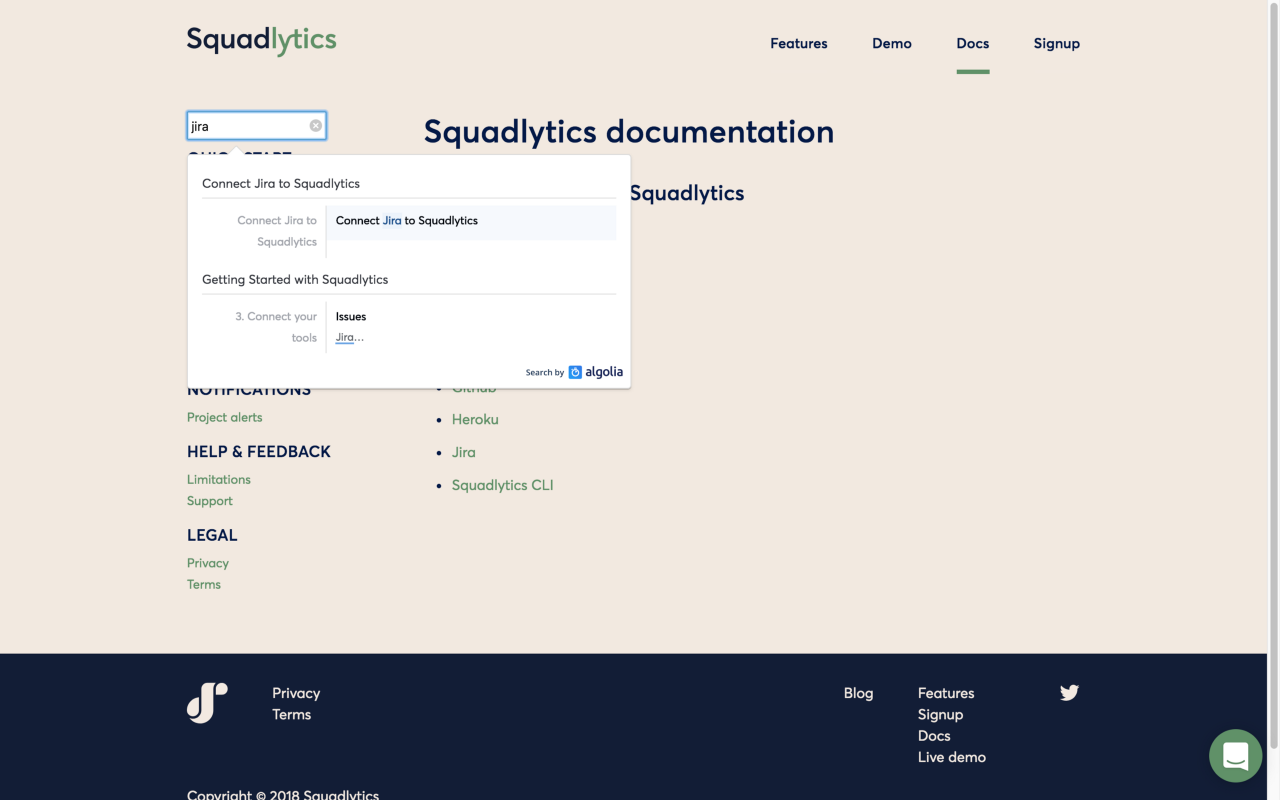
Now if you reload your application you should be able to use the search field to search your documentation.
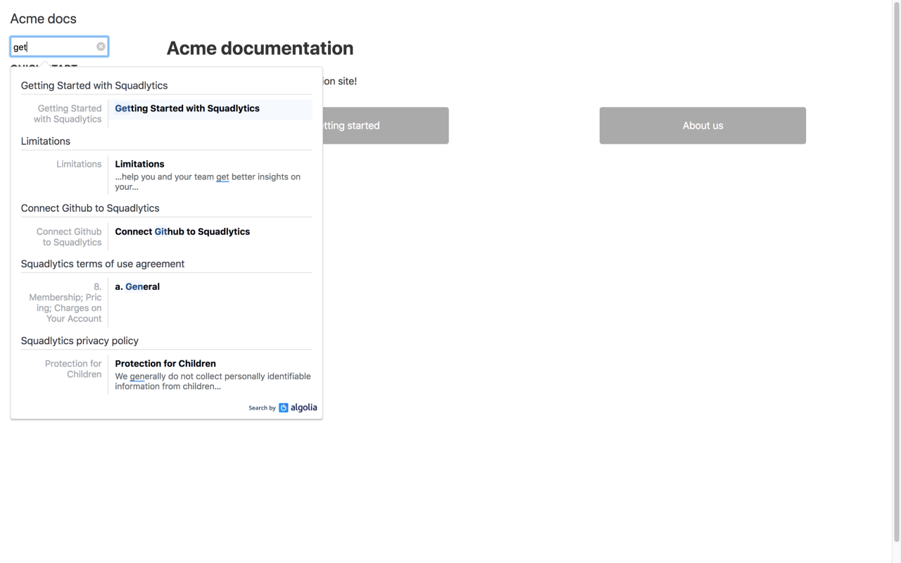
Ok, I cheated here and used the search index for https://docs.squadlytics.com
4. Deploying to Netlify
To enable the search on prod just add the corresponding env variables to your build configuration in Netlify.
Moving forward
As said in the intro the Docs Starter Kit is open source and you can find the code on Github (pull requests are welcome!). This is pretty much the same as the code that powers our docs and we wanted to share our learnings to help others in similar situations.
Squadlytics is a Team Analytics platform that gives you automated reporting and alerts on projects.
Follow us on Twitter and don’t hesitate to say hi at [email protected].