Why spreadsheets are bad for OKRs
You might be obfuscating risks if you're tracking OKRs by replacing values in a cell. Being green does not always mean being on track.

I have a love/hate relationship with spreadsheets. I can do almost everything with it, but it quickly becomes a nightmare if you're using it for goal-tracking. Let me explain.
Why do we track OKRs?
Tools and frameworks are here to assist us and make problems easier to solve, but they're generally not the answer by themselves. When teams adopt the Objectives and Key Results (OKRs) framework, it's not because they need another set of practices. It's because they want to be more outcome-driven.
The OKRs framework has 2 components:
- The Objectives (Os): qualitative statements that describe the outcome that you want.
- The Key Results (KRs): quantitative goals that define success.
Now, it's not enough to define your OKRs at the start of the quarter. If you want your organization to be outcome-driven, then your teams should be measuring progress on the KRs every week. This is where spreadsheets usually come in as a way to keep track of progress — and this is where things get touchy.
But before we look at the issues with spreadsheets, I want to talk about status updates.
What makes a good update?
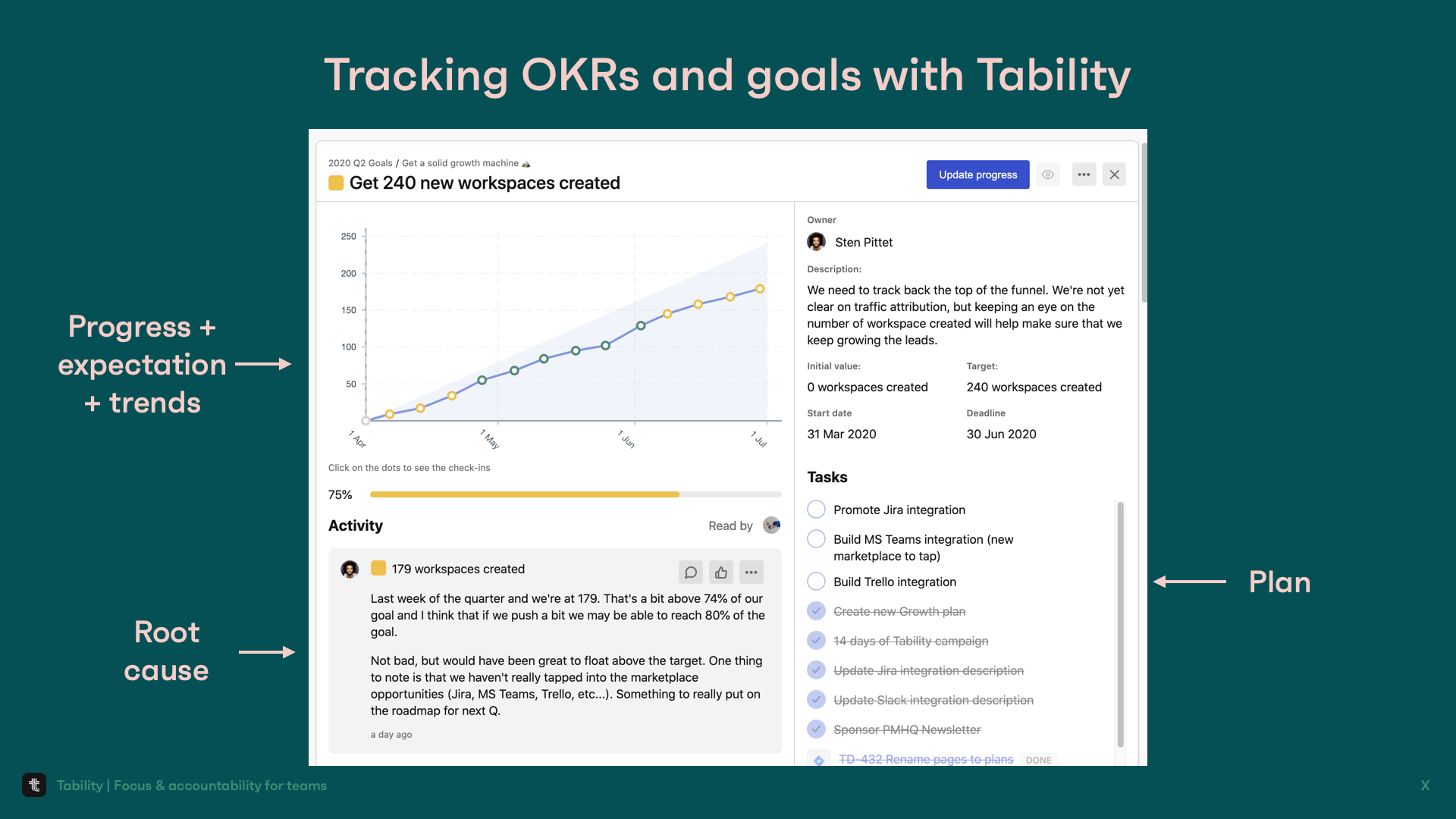
A good update should answer these 5 questions:
- Progress: where are you today?
- Expectation: is this where you're supposed to be?
- Trends: are you getting better or worse?
- Root cause: what do you think happened?
- Plan: should you do something differently?
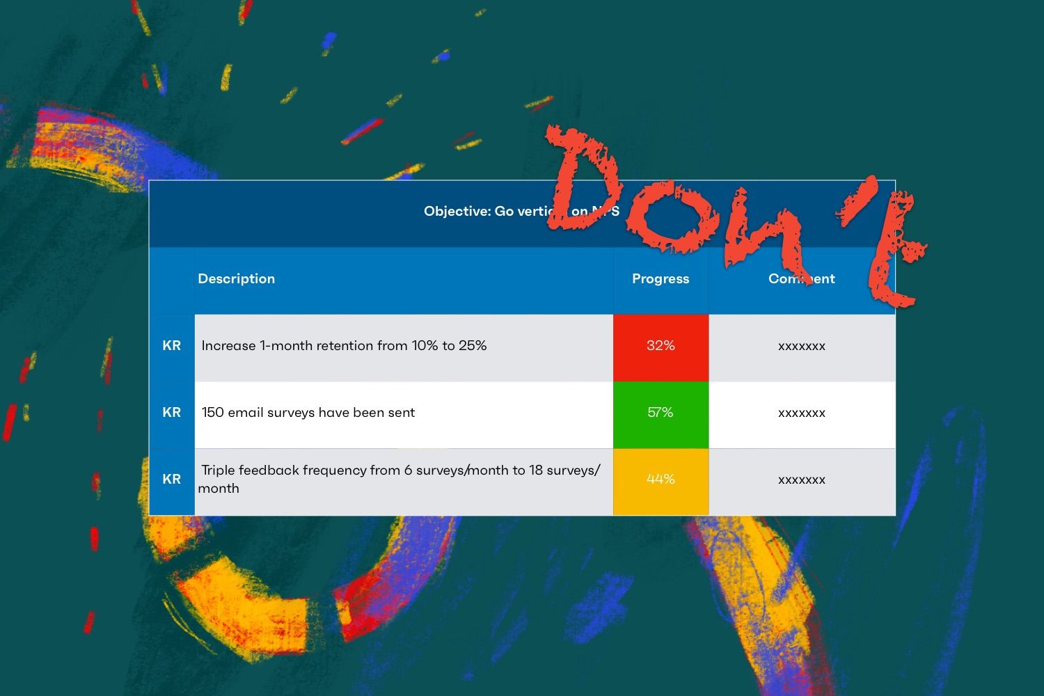
So, when you're using OKRs, you want to cover these 5 points every week. When you're getting started you usually end up with a table like the one below:
- A colored cell with completion percentage for progress and expectation.
- A cell with comment for root cause and plan.
Every week, the team comes back to that spreadsheet and replaces values in the cells. And here's where things get bad: you have no sense of trends and you keep losing your history.
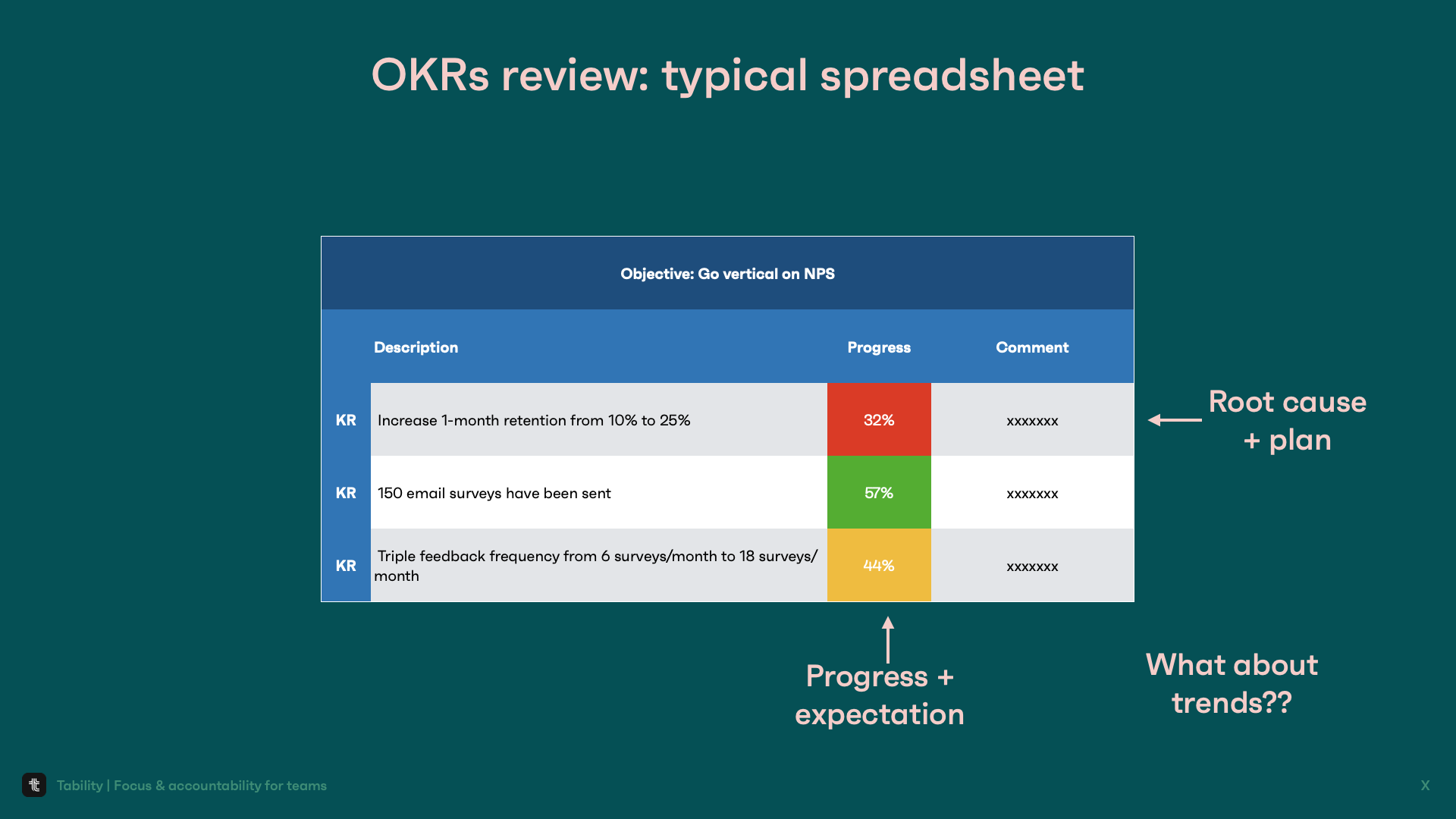
Why trends matter
Look at the picture below
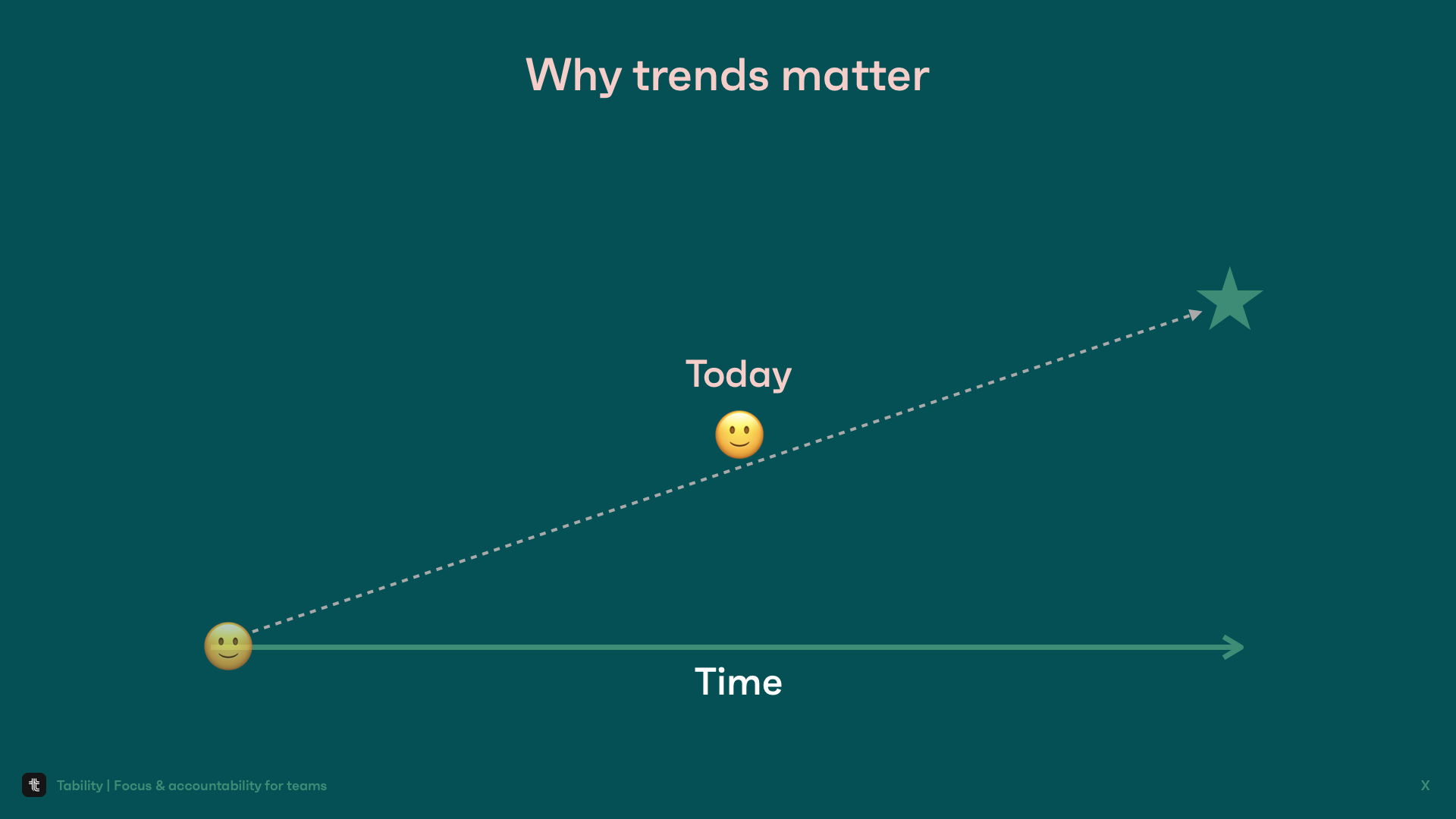
It feels like things are in good shape and this chart could be the equivalent of the green cell in the table above. We're above the target line half-way through the quarter. All good? Well, let's look at the previous updates.
Now the situation doesn't look so great anymore. In fact, we should be panicking at that trend because it looks like we're going to crash.
Trends and weekly progress with Tability
What you need instead is a simple way to visualize weekly progress. A graph can tell a story faster than percentages in a cell. I should be able to understand what's going on by glancing at a graph, and this graph should be easy to maintain. Of course, you can try to replicate that with a spreadsheet but that's precisely the problem we're solving with Tability.
We automate feedback with reminders and simplify goal-tracking. Our job is to help your team stay focused and accountable - with minimal effort.
Check out the video below if you want to know more about Tability, and you can get started for free at https://tability.io